Wednesday, December 2, 2009

Tick Tock Time's Up

In only a few years' time, watches have evolved from being an object worn for practical use to more of a fashion accessory. Since the introduction of slimmer more portable cell phones, and the accessibility of other technological gadgets such as iPods, the need for a watch has been replaced. People of younger generations are rarely seen wearing watches, as most of them can view the time immediately on their cell phone or music player. Other functions of the watch have also been taken over by these gadgets, such as timers and alarms.

It seems that watches are drifting into a thing of the past, yet designers are still continuing to make them. Watches have become more of a symbol for luxury and status, and designers are well aware of creating a continued desire for a watch knowing that it's function is longer as valuable as it once was. They are designing to attract the consumer to a piece of jewelry, emphasizing the quality and exclusivity of the watches since need is not really a factor.


This shift in society's view of watches is evident in the portrayal of the inner working parts of a watch on the Victoria's Secret Fashion Show.Model Candice Swanepoel on the Victoria's Secret Fashion Show. Photo courtesy of Yahoo.

The model is seen wearing a set of angel wings inspired by the mechanical movement inside watches. It is interesting to note that the style of the wing paired with it is painted in a dark gothic style similar to that of gargoyles on the outside of gothic cathedrals. This pairing makes the association of watches with something old, seeming to indicate that watches have a vintage characteristic to them.

For society, this may show that as the meaning of a watch is shifting, future generations will not experience the same meaning a watch has for those who used them before the technological age of cell phones. It may take on the meaning that lockets have for us now, as they are often worn as vintage jewelry as a fun accessory and without anyone's photo inside.

Sunday, November 22, 2009

Looking Delicious

Since the first time I saw an episode of Ace of Cakes on the Food Network, I'd been amazed with the creativity that fondant made p0ssible. Before the use of fondant in cake design, there was the constraint of what would be able to hold up in what size and for how long. This new sturdier material allowed for a new way of thinking, to create a new kind of cake.

The people who work at Charm City Cakes, who are the stars of the television show, are masters of creating art using edible food materials. Their cakes have such intricate detail and realness that I almost don't want to cut it up to eat because it would be like destroying someone's art. I feel like the greatest appeal to these cakes, such as the ones listed under "shaped" on Charm City Cakes gallery on their website, is that if a person wasn't informed that it was a cake, they probably wouldn't make that their first guess. My favorite example, is the crayon box cake because everything from the images on the signature green and yellow box to the shape of the crayons is so accurate in the replication.
Crayon box birthday cake. Photo courtesy of Charm City Cakes.

This idea of creating something that changes the look of the material people expect is really interesting. It's like the food shaped erasers I find in Japanese $1 stores. They look so much like shrunken foods, but at the touch we know it is a bouncy eraser.

Food shaped erasers. Photo courtesy of Vat 19.

We can also see this is in food being transformed into fashion pieces. Sweets, such as sugar and chocolate, were used by Japanese patissier Koutatsu Kanda during the Tokyo Sweets Collection in Tokyo. Models wore extravagant masks, hair pieces, and hats made from sweets. Looking at some of the photos, I wouldn't be able to tell that the material being used to make these pieces were edible. To me, they looked like dramatic costume pieces with no hint that they were food, except for the one cake shaped hat.

Photo courtesy of Yahoo News.

Photo courtesy of Yahoo News.

Photo courtesy of Yahoo News.

I find this to be an interesting new way of designing. It is a new way of thinking, and adds extra interest to the final piece when the audience finds out what it really is that they are looking at. The piece becomes more dynamic as it can be viewed as what it appears to be, and also as the material which is what it really is in essence.

Saturday, November 21, 2009

Deep Sea Inspiration

Yesterday, I was on Yahoo News showing my boyfriend a photo of a pink translucent jellyfish that I thought was beautiful when he decided to show me an unusual sea creature called a Nudibranch. They can be most basically described as toxic sea slugs, which doesn't sound very attractive, but many of these creatures boast vibrant color combinations that do make them quite beautiful to look at.

A photo gallery of the Nudibranches on National Geographic's website is very appropriately titled, Living Color.

The Chromodoris annae. Photo taken by David Doubilet for National Geographic.

One of the first thoughts that came to mind when I first saw photos of this nudibranch was that I could immediately imagine a dress done in that pattern, or an entire room with that color palette. I want to emphasize that it's not simply just the color that is inspiring but the texture and pattern as well. The spot pattern of black in tiny dots all over with two large splotches in other areas, accented with a bright yellow is very interesting to the eye. It is almost like a new take on a leopard skin pattern.

The Phyllodesmium iriomotense, a translucent nudibranch. Photo taken by Jennifer Hayes for National Geographic.

This nudibranch, one of the few which are colorless, is still amazing to me for it's star-burst shape. It's a shape that looks very natural, and much more dynamic than something you could find on a rubber stamp. The contrast of it's smooth outer with the spindly insides is also lovely, especially with the blue glow. It reminds me of how people enjoy decorating with branches inside glass vases. They also remind me of how it looks when people use ribbons or lace in flower bouquets.

A smooth man-made glass vase contrasts against the natural curves of the branches, in a look similar to the nudibranch especially because of the translucent quality of the glass. Photo courtesy of Randy McManus Design.

The ribbon used in this bouquet creates a look that I relate to the blue glow of the nudibranch. Photo courtesy of It's All About Weddings.


I was really glad that my boyfriend showed me these sea creatures, as I probably would never have come across them on my own. It goes to show that opening our minds to more than what is involved in our everyday lives and personal interests can bring us great sources of inspiration. I feel that most students tend to explore within their own field of study, including myself, but having friends who study in many different majors telling me about the things they learned and found interesting has kept me open. I believe that the more places a person can find inspiration, the more unique their work will be from others because of the interesting blend of what they have been exposed to.

Friday, November 20, 2009

Make Me Over

I love it when I get to sit down and watch an episode of TLC's show Trading Spaces. For those of you who aren't familiar with the show, it is mostly about renovation. The host, Paige Davis, takes two sets of people who switch homes for 48 hours and a budget of $1000 to improve their home. They're usually friends, family, or some other type of acquaintance who swap places, so the upgrades can be done knowing what the owner's likes and dislikes are. My favorite part is watching the team of designers work with the materials at hand, mindfully using their $1000 budget. The results are almost always amazing, and their creativity does a fine job stretching the dollar to its best.

Watching the different techniques the team uses to transform ordinary furniture into interesting pieces to showcase in a room is what I enjoy most. I feel like it is a more challenging task to change the aesthetic appeal of an already finished product than it is to go buy material to make exactly what it is you want to have. After seeing many different episodes and picking up tips on different techniques, my mind likes to imagine improvements of pieces as well as ways to make something more useful.


Awhile back, I came across an armchair somebody no longer wanted. The seat had very feminine curves to the shape, like the one from Pixar's film Up. The curves continued down to the chair's wooden base, which was really what had caught my eye in the first place. It had a shell motif carved out in the center, and Rococo style legs in the front. The previous owner did not want the chair because the wooden base was loose and unattached to the actual seat, and the fabric was getting old. I decided to take the wooden base to start a DIY-project of transforming it into either a low side table or an ottoman type of seat.

The seat base after being painted and sanded down. Photo taken by me.

The shell motif in the center. Photo taken by me.

The Rococo style legs. Photo taken by me.

As of now, I have only had the time to sand down some areas and paint it over with a white paint. My plans for the next step are to purchase a sheet of plywood to cut down to the correct size, and make a final decision on whether I would like an ottoman or side table. I'm leaning towards making an ottoman, since the base isn't completely parallel with the floor, so if I were to set a drink on it, the possibility of spilling is a bit higher, whereas the tilt doesnt matter quite as much for a seat. To make the cushion I plan to buy some fabric and use the filling from my old pillows, staple punch it neatly to the plywood and attach it to the base. I am also considering adding some accents to the base using some gold acrylic paint and a stippling technique I picked up from Trading Spaces, but I will decide on that later as well.

When I shared my ideas with my friends they thought it was incredibly creative, but I feel that my idea is not very unique at all. Many have been doing these projects for a long time now, and mines was the result of inspiration from these people and their work. I feel that this highlights the wide possibilities of these techniques, and this way of thinking. Much can be done with the materials that others label as "junk" and it is time we look that way for resources. I believe it is a new way of designing that requires more thought, because of the constraints of the original piece provides, but it is a challenge that is resulting in new looks. I especially appreciate the work of those who use old furniture that captures older styles, maintaining that essence of the old in their renovation and giving it a more modern aesthetic.

Wednesday, November 18, 2009

Color Me

Understanding color theory is vital to achieving a desired emotion from an audience. The color wheel allows for many combinations, and through an understanding of the relationship between the colors, a color palette can be chosen carefully to evoke a certain feeling. I notice this particularly in interior designs, because the colors in a room greatly affect how comfortable I feel immediately as I enter.

Photo courtesy of Action Interior.

First, knowing which colors belong in the warm and cool families makes a big difference. For example, this interior shown above makes use of orange, yellow orange, as well as different tints and shades of brown, which is essentially a shade of orange. The interior makes use of warm colors to create a sense of relaxation and comfort. I can imagine the little cups on the side table to be filled with hot coffee, and for there to be a fireplace on the other side of the room. The choice of colors definitely reflect the leaves of autumn.


Photo courtesy of Top Design Blog.

In this example, the interior consists of many tints and shades of blue, a cool color. From looking at this photo, I feel a sense of tranquility. It reminds me of water, bringing my mind to think of the ocean and going to the beach. This isn't to say that colors always signify a specific season, but that like the seasons, they do have a distinctively different feel.

Color theory also includes understanding color "harmonies", colors that go well together. Designing with these in mind will create visual appeal, instead of looking unmatched. The photo below is of Pure Yogurt Shop, which utilizes the color harmony of split complementaries. On the color wheel, a split complementary is one color, and the two neighboring colors of it's complement, which is the one directly across the wheel. It creates a dynamic look, without having as strong of a visual impact as complementary colors would.

Photo courtesy of East Lake Directory.

The colors used in the dining room below, are complementary. Using these colors creates a bold look, with high contrast similar to using black and white. The mood of this room is certainly different from the other examples before, as it has a much more vibrant feel as the colors enhance the intensity of each other. A calmer mood resonates from the first two examples, as the color scheme is almost monochromatic and the eyes are not as excited.

Photo courtesy of Home Design Photo.

Color theory is not only important for visual appeal, to create harmonious color schemes, but it is also useful as a cue for an audience. In associating colors with emotion, we can also see them as active characters, reacting off one another, and the result of that interaction becomes what the audience sees. It can serve as a cue as to what type of environment it is, and from there what behavior can be expected, as well as what may be appropriate dress. For society, color theory can accomplishes a lot, and a better understanding of the relationship between colors around the wheel can lead to designs that more accurately portray the desired mood.

Tuesday, November 17, 2009

Have a Seat

I was scrolling through Apartment Therapy's blogs, admiring the lovely photos when my eyes caught the words "Papasan Chair." I've always adored the idea of a giant pillowy chair, and I can't help but plop down in one for a few seconds every time I visit Cost Plus World Market, but I don't actually have one of my own. The only thing I'm not fond of with the papasan chair is the bamboo structure. It is just very unappealing to me as a complement to the soft cushion, because it makes me feel like the chair belongs outdoors in a patio and not in my room for lounging.

On the blog, someone had posted a request from readers for ideas of alternatives to a papasan chair. One of the comments suggested looking at Ligne Roset's "Pumpkin" chair, and through curiosity I decided to look it up.

Photo courtesy of Ligne Roset.

The "Pumpkin" chair reminded me of thumbprint cookies, because it was essentially a large cushion with a rounded dent in the center. Unlike the papasan chair, it was entirely covered in fabric, making it more obvious as indoor furniture, and it also gave it a more luxurious look.

Photo courtesy of Ligne Roset.

Ligne Roset's entire collection of products, which range from furniture for the dining room, living room, office and bedroom, are a harmonious display of sleek meets comfort. The strong lines in this collection paired with simplicity give them a modern feel, and rather than looking stiff and uninviting, they appear comfortable and warm because of the choices in materials and shape.

Photo courtesy of Ligne Roset.

For example, the armchair "Torn" has a structure that looks like it could be folded from paper. These "folds" create lines which are a prominent part of its design. The arms on the chair are two pieces folded forward and these creases are the most noticeable, and also the most unique and attractive part of the design. It highlights the contrast of the soft cushion and the hard base. Looking at the chair as a whole, there are certainly elements that make it look inviting rather than intimidating. With a slight tilt backward and its forward-facing arms, it looks as if it's ready for a hug.

Photo courtesy of Ligne Roset.

Having a similar effect as the arm in the "Torn" armchair is the "Moel" chair. The middle of the back of the chair is noticeably higher, then slopes down on both sides, wrapping around as arms which curve outward. It has a distinctive silhouette like a flower in bloom, and the open arms signify invitation. Similar to "Torn", it also has strong lines as part of the design, but paired with elements that create a warmer feeling.


Both chairs, are examples from the collection I enjoyed most for how well they demonstrate the harmony of rigid structure with comfort. They demonstrate how two seemingly opposite characteristics can be combined beautifully, inspiring combinations that may seem unlikely to work.

Photo courtesy of Ligne Roset.

The search for a papasan alternative, and Ligne Roset's creation of the "Pumpkin chair", is a great example of observing what has already been done, and improving or updating it to fit the needs and desires of modern society. It inspires looking at designs from history or globally to think about its appeal and bringing that idea into a modern design.

Monday, November 16, 2009

Meaningful Objects

Today I watched a documentary film entitled "Objectified", by Gary Hustwit, which featured the voices of various people around the world working with design. It focused on the "complex relationship with manufactured objects and, by extension, the people who design them," according to the film's website.


It was certainly interesting to be given the opportunity to watch designers at work, to hear the ideas that led up to a concept and to understand an object's purposeful configuration. Seeing all the thought that goes into the conceptual stage really boosts the meaning of an object. It was this aspect of the film that truly caught me, the weight of meaning an object can hold for a person.


One of the featured speakers in the film, made a point that if a natural disaster emergency were to occur, most people would take with them the objects with sentimental value not monetary value. It struck me as interesting human behavior that so much of what people keep is not dear to their hearts, and this led me to think about why certain objects hold their sentimental value while others have value that is forgotten.

I started to think about what items I would take with me if my apartment were to go up in flames, and the first thing that came to mind were my photos and my jewelry. Although jewelry involves much more design than photos do, they both have significant value because of the stories they hold. My photos are obviously important to me because they are moments in my life captured on paper that I can look back on to relive. They show the faces of people I love, so when I look at the photo I am reminded of them. My jewelry is important to me for the stories behind how the piece found its way to me, and also as a memento of a time that I wore it. The experiences are then a part of the jewelry, and it is more than just an accessory to my appearance because they say something about me.

Photo taken by me.

I feel like the same can be said about a child's old teddy bear. The teddy bear is not seen as the fuzzy fabric covered polyester stuffing that it physically is. To that child, it is like a friend with whom adventures were shared with. It comes to represent all the fun of playing.


Photo courtesy of Picture Book.

It is interesting to think about why people adhere strong feelings to certain objects and meaning disappears for other objects. In my opinion, objects designed for gifting or for passing down to further generations are the ones that hold the most meaning. For example, family heirlooms which are passed down have many stories attached. A necklace passed down will carry the story behind how it got to the first owner, stories about where that piece has been worn, stories about what it meant to wear it, and possibly even more.


Photo courtesy of Heirlooms by Ballou.

A piece that can carry meaning for a lot of people is a successful design, in my opinion. It can withstand time, and span across cultures in its importance, and the worth is heightened because it goes beyond the intrinsic value of the material it is made from. I think it could benefit society to look at the idea of meaningful objects, to create things that are versatile and appreciated by more than just one type of individual.

Sunday, November 1, 2009

Quilting

Today I went to visit the Nelson Art Gallery, this time to look at their collection of African-American quilts. Whether made from a variety of fabric scraps in different colors or from a chosen palette, all the quilts had a clear pattern throughout the piece. I took photos of two quilts I wanted to share, both featured as the work of African-American slaves, and both incredibly beautiful.


This quilt caught my attention first because it was the only quilt that had a modern feel to me because of the four quandrants. With the other quilts, I didn't feel like there was a clear division of space as everything seemed to flow seamlessly, but with this quilt I certainly could distinguish it.

Even so, the pinwheel-shaped forms repeated in the four sections move the eye through the piece smoothly. There is a sense of movement in their shapes, and the pattern of color in the petals create a rhythm that brings the viewer round and round the quilt in a circular path.


Of all the quilts shown in the gallery, I found myself standing in front of this one the longest. I really enjoyed the array of colors as well as the non-uniform size and shapes of the fabric pieces that make up the background. Alone, the background may seem almost chaotic, but the piece is unified by the repetition of a starburst type of shape done in black. This pattern of a black star shape on top of a colorful background is so playful, as no two stars are the same, yet the similarity of the form is recognized by the eye, creating a smooth flow through the piece.


Aside from being beautiful textiles, and a wonderful example of recycling fabrics, these quilts demonstrate how pattern created through repetition can really unify a piece. Quilts are traditionally made from scraps of fabric, showing how a pile of miscellaneous things can join together into a piece that makes sense as a whole when designed consciously, such as by incorporating a repeated pattern.

It is a technique that can be applied far beyond just fabric scraps. For example, a large collection of old books can be just that, but when arranged strategically by the colors of the binding into a pattern, it can be made into an appealing display on a bookshelf.

With a bit of creativity, you can change the way you see your collections.

Saturday, October 31, 2009

Costume Creation

As today is Halloween, all I can think about are costumes. Downtown, all the little children are running about with their parents dressed in a special outfit they can only wear this one special day of the year. What intrigues me about costumes is that with a few key items we can almost immediately identify who a person is dressed as, and they are these distinct cues that costume makers have to pick up on in order to develop a costume.

Costume designs are very much dictated by the general view of society, as societies creates their own definitions. A successful princess costume is one that will have its wearer instantly recognized as a princess and unmistakable as anything else. But if that design were to be brought into another culture, it might not be received in the same way.

The interesting thing to me about costumes catering to society's views, is how designers come up with costumes for celebrities. One of the most popular celebrity costumes for this year I suspect will be of pop singer Lady Gaga. Her personal style is to an extreme in comparison to an average person on the street, which makes it a little easier to dress as her, but still I was interested in finding what was considered key items for someone who wanted to impersonate the infamous fashion rule-breaker.

In her own words, Lady Gaga suggested wearing, "Wigs, purple shampoo, and high heels. Lots of latex" according to MTV News.


It seems that everyone else has interpreted her style much differently, sans the purple hair. In my opinion, the most popular Lady Gaga costume ideas stem from how she appears in her music videos. This seems to make the most sense since it's likely that the majority of people have seen clips of her video rather than paparazzi shots of her day to day outfits.

Popular beauty "how-to" girl Michelle Phan on youtube shares her interpretation of Lady Gaga's look in a make-up tutorial. The look is based off of her music video for the song, Pokerface.


Blogger Ashe Mischief at Dramatis Personae has also compiled a list of necessary pieces in order to be easily perceived by others as Lady Gaga for Halloween.
Photo courtesy of Dramatis Personae.

Design, may it be costumes or something else, must take in the public's views and interpretations in order to be successful. If it were to be based on just one person's view, it wouldn't be very effective.
In this example Lady Gaga's suggestion on wearing a purple wig would not be a strong choice as most websites and images searched through Google will suggest that you go for a blonde wig with blunt cut bangs.

While it is important in design to pay attention to majority's view, don't forget to let creativity break through!

Happy Halloween :]Photo courtesy of MSN.

Friday, October 30, 2009

Fold. Crease. Fold.


Photo courtesy of Wikimedia Commons.

I remember when I was little I used to pass my time away folding origami, from cranes to gift boxes to jumping frogs. I've always been curious about the process one goes through to come up with an original origami, and furthermore how they determine the steps of the process in order to communicate them to others. So much of origami is in the process of creating it, although that part is often overlooked because of the attention given to the final product, but it certainly isn't forgotten. The folds and crease marks are as much a part of the final piece as the shape of the object.

Today, I stumbled across the works of origami artist Cindy Ng. She has taken the remarkable craft of origami beyond paper to more luxurious materials, silver and gold. According to her interview with Charmingly Chic, each piece of jewelry from her company Origami Bijou is created using a sheet of precious metal and is folded like paper into a wearable origami.

In her interview, she is quoted saying, "Jewelry is a good way to share a classic art form with the world." In my opinion she certainly maintains the essence of origami in her jewelry designs, as the necessary folds of the process are visible even while they are made of metals.


Photo courtesy of Origami Bijou on Facebook.

Photos courtesy of Charmingly Chic.

Her designs bring the delicacy of paper origami to an approach that creates much longer-lasting pieces through the use of precious metals. The long tradition of paper folding art moves into a modern application, introducing a new form of art. I find her work very inspiring, and brings me to think that perhaps techniques in textile making could also be transferred into jewelry-making for some unique pieces of art.

As someone who really admires origami, I am very excited to discover her line of origami jewelry. The charm to her jewelry line, is the look of handmade art, and wearers can relax because unlike paper, this origami won't be crushed easily.


For those of you who haven't tried origami before, here's a quick and fun tutorial on how to make a swan! It was the very first thing I learned to fold, and it obviously hasn't detered me from learning more as I'm still a big fan of the craft.

Hope you enjoy!


Sunday, October 25, 2009

Nails

Nail art is an incredibly expressive form of design that makes a statement just as clothing does. Fingers become a blank canvas, where much more than just color can be used. Having the skills and the patience to do such intricate work on a tiny surface is something I definitely admire and see as a growing art in the beauty world.

One of the charming aspects of nail design is that a theme can be carried through a set of nails, with variations in the design of each nail. It draws interest to the individual designs, and it is amazing how much detail can be contained on a single nail.

Photos courtesy of Trend de la Creme

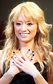
Many designs become so extravagant, that they are far beyond practicality. Artists even extend beyond the space of a nail bed to adding dangling accessories. I find these to be powerful statements similar to the effect of wearing ornate jewelry. Some celebrities pose in a way to draw attention to their highly decorated nails, in a way similar to how some would show off their new engagement rings.

Flaunting Nails
Japanese singer Ayumi Hamasaki. Photo courtesy of Morning Cafe.

Chinese singer Jolin Tsai. Photo courtesy of Nitrolicious.

Flaunting Rings
Actress Jennifer Love Hewitt. Photo courtesy of Faded Youth Blog.

Actress Jennifer Lopez. Photo courtesy of Life & Style Weekly.

As a form of self-expression, nail art is somewhere between jewelry and tattoos in terms of permanency. They are more attached to the body than a bracelet may be, but they do have a wear-life that doesn't compete with lifelong tattoos. I do believe nail artists will gain more recognition for their work as art in the future the way tattoo artists and jewelry designers have.

Perhaps in the future, since nail art serves the appeal of wearing an accessory, instead of donning corsages on their wrists, girls will have embellished nails matched to their prom dresses.

Photo courtesy of For Ladies by Ladies.

Saturday, October 24, 2009

One of my favorite blogs to visit is dailydanny.com, where green living expert Danny Seo writes about various topics that all relate to an eco-friendly lifestyle. Awhile back, I remember coming across this photograph of his craft room and absolutely fell in love with how it so gracefully combined elements of interest in a way that maintained a sense of simplicity in the room.

Photo courtesy of dailydanny.com

The most striking feature was the set of silhouette plates hung on the wall for decoration. Although the plates were not uniform in size or material, as some had a foil-like shine while others had more of a lacquer finish, their round shapes as well as the black color created a sense of unity in the display. Each plate featured a unique silhouette or design, which was something I spent time looking at later, and they certainly help to move the eye through the display as a whole. For example in the upper middle of the piece, the image of the cow faces right guiding the eye down through the plates to the right of the window. Then, the plates on the right feature images that move your eye into the the display rather than out of it, such as the turkey, horse, and two people facing left. I found this to be a strong point in the display because viewers are continually moving through the piece.

The room itself has great sense of balance. Symmetry certainly helped to achieve this feeling through the placing the same item on both ends of the wall, such as the mirrored shelves on the walls as well as the table supports and stools. Furthermore, the plate display works well with other elements of the room to create unity through the color black. The first thing I look at in the picture is always the plate above the window with the cow, then my eyes move down the plates along the right, down to the table support, to the stools, then up through the plates on the left, back to the cow plate. This circular path that my eye is drawn through is based heavily on the dark color of those elements, and the variations in the repetition of black in the room make it interesting.

This photograph shows a great design for a small little nook, and is also inspiring for all who are looking for new ideas of decorating. Most of the time little spaces in the home become wasted space because people don't know what to do with them, and this is a wonderful example of a useful solution. It also shows that a beautiful wall display doesn't have to cost a fortune. In fact, the silhouette plates were created by Danny using old plates from thrift stores, some images printed from online, and porcelain paint. Using this technique, the possibilities are endless because different colors could be used or different shapes of plates, or even something other than plates! With a pinch of creativity, this simple craft can result in a truly unique design for just a few dollars.

Friday, October 23, 2009

Look Again

I was sent an interesting video yesterday that made me think about how much people are intrigued by things that are out of the ordinary, and how design serves to create that excitement.

In the first part of the video, they filmed how most people exiting the subway take the escalator out instead of the stairway. Then the second part showed the creators of the video making real the idea of designing the stairways to look like a piano, so that each step was a key on the piano, making it the more appealing route for people to take. The best part of their plan was that when a person steps on a stair, it will actually play a note. Their theory was that if they could add an element of fun, they could change people's behaviors. The video then showed the group of experimenters working late at night placing strands of wire on the steps for the sound, and laying sheets on top to represent keys of a piano.
I absolutely love the idea of a gigantic working piano
. It can brighten a person's day while they are out and about on their usual routine trip on the subway. It's also amazing how the image of short black rectangles on larger white rectangles immediately registers in our minds as a piano, even when it is on an incline instead of flat.

In my opinion, the design was incredibly successful, as it certainly grabbed attention and people immediately knew how to interact with it. Unfortunately, it seems the piano stairs was a temporary design for the sake of experimentation.

Luckily, for some similar fun you can visit New York's FAO Schwarz store where they have the famous giant floor piano, which was featured in the film
Big starring Tom Hanks.

Photo courtesy of http://blogs.amctv.com

Wednesday, October 14, 2009

Take Me Out

Inspiration comes when I remove myself from everything that is a part of my usual routine. Once I'm outside of all things that relate to me, there is more to see, hear, smell, taste, and touch because to me they are new.

The best source of inspiration outside oneself is through the experience of travel. Fresh ideas will be whirring through your brain every minute as you become submerged into a new culture, lifestyle, and community. Even things that would normally seem mundane, such as the weather, can become interesting with the backdrop of a new city.

For example, when I traveled to Hong Kong the way people put together outfits, and the individual pieces of clothing were so different from the clothes I wore. Most of all, I remember going to a trendy jewelry store because it was packed with girls my age. There I discovered earrings where two studs were connected by a chain, intended to link the cartilage piercing with the lobe piercing. The look was something I had never seen, or had even thought of. The chain-link earrings were done in many variations, some with rhinestone chains and others with more delicate ones. Some were even done in themes such as a pirate one I saw where one stud was a sword and the other was a skull and crossbones. It definitely inspired some diy projects.

But traveling doesn't always necessarily mean leaving the country. It could also mean just getting away from the usual. It's so refreshing to have new things to look at even if it's somewhere you've been before. I always love visiting San Francisco even though I've been there countless times because every trip is different. Inspiration, in my opinion, is in everything, but it's just that we can't turn our senses on to the things we've become so accustomed to being around on a daily basis.

Tuesday, October 13, 2009

Give Me Pretty, Don't Give Me Plain

While browsing through all the insanely cute useful things sold on fredflare.com, all I could think about was how ugly my kitchen aid skillet was because it didn't have a smiling panda on it. Then suddenly so many things in my kitchen seemed so ugly and boring like my measuring cups because they weren't cute little russian dolls, my cutting boards because they weren't blue and elephant shaped, and my spatulas because they weren't bright green with a smiley frog shape.

Actually to be honest, I wouldn't want my kitchen full of that stuff, but I have to admit that practical everyday things that we fill our homes with are not all that aesthetically pleasing. It's so easy to find everything in plain black, void of color or pattern. That's why I fell head over heels the first time I saw a cartoon character shaped USB flash drive where u pop his head off to plug him in!

In my opinion, bringing an artistic element to practical everyday items is a huge market for designers. I definitely see it growing in the future, especially as I discover the beautiful things people have crafted on etsy.com. If beauty is so valuable and enjoyable, we have no reason to neglect it from being a part of the things we use so regularly. Even for someone who would prefer the simplicity of plain objects, I don't think they would object to having more available options.


In case you are curious to see the cute kitchenware I spoke of, here are some links to them:

panda skillet
http://www1.fredflare.com/customer/product.php?productid=5388&cat=316&bf=sw
doll measuring cups
http://www1.fredflare.com/customer/product.php?productid=5244&cat=316
froggy spatula
http://www1.fredflare.com/customer/product.php?productid=5335&cat=316
cartoon flash drive
http://www.fredflare.com/customer/product.php?productid=5205&cat=309

Monday, October 12, 2009

Traveling at Anthropologie

Over the weekend while visiting an Anthropologie store in the Bay Area, unlike the usual shopper who would be engrossed with the clothing, I was drooling over their imaginative displays.

First, from the outside of the store the front glass windows of the high ceiling store were decorated with none other than painter's tape, which is a type of masking tape that removes from the surface cleanly. In the colors blue and orange, this tape was stretched across the windows with twists and turns for a composition that resembled a gigantic road map splayed on glass. Upon opening the doors and entering, the first display to meet my eyes was a very abnormal display stand. Attached to a steel pole were three old wooden drawers, one on top of the other but each angled to face a different direction. Taking a peek at the contents, I discovered them to be little trinkets sold in the store.

Turning around to look at the backside of a mannequin I was admiring earlier from outside, I now noticed that it stood on a wooden platform with four wheels at the bottom. Next to the mannequin were four old, worn out suitcases stacked on top of one another, in a seemingly careless fashion yet obviously well balanced. As I made my way further into the store I saw a model of a small town made of paper, with swirling wires poking out. As the ends of these wires were paper planes crafted from old road maps, adding a sense of real travel.

Throughout the store I found many more displays that carried the theme of travel in an way that felt imaginative and playful. Not only were they interesting to look at, but they initiated thought of travel and exploration. The design was not aimed toward selling clothing to customers for travel purposes, but aided in selling a lifestyle. In my opinion it was very effective in defining what the company stands for, and the type of customer they appeal to.

Not only were the designs indicative of an exploring nature of their customers, but also to a liking for things handmade and vintage. For example, the display stand was obviously not a mass marketed piece of furniture and by filling them with trinkets it gave customers the feeling of going through their grandmother's old jewelry box for vintage finds.

This one is definitely one of my top favorite displays that I've seen from Anthropologie so far, not simply for the creativity and aesthetically pleasing nature of it all, but for the complex meaning of the overall design as a definition for the company's target customer.

Saturday, October 10, 2009

Multifunctional Trend Aids Minimalism

New technological devices are continuing with the practical trend of providing more than one function. Most obviously, cell phones are no longer used simply for making calls but are now taking the place of wrist watches, monthly planners, mp3s, cameras, and even more. With the millions of applications available to users, a cell phone can essentially erase a work desk of clutter. A multifunctional device like this could allow someone to live like a minimalist.

At a time like this when society is highly conscious of their level of consumption of the world's resources, minimalism seems favorable. Designing products that allow users to accomplish their tasks while consuming less than they normally would is definitely a step toward a greener earth. For example, using a calendar application on a cell phone instead of a monthly planner saves paper.

Aside from being earth-friendly, it could also be aesthetically pleasing in the home. Many share a desire to have less clutter in the home in busy areas of the house which are often the kitchen and the living room. Imagine having one appliance to take care of toasting bread, heating up leftovers, opening cans; basically doing all the things that the appliances on your kitchen counter do. For college students, it would be a dream to have only one appliance to pack up and carry every time they move.

In the living room, one could say that technology has answered the request for minimalism. Game consoles such as the Playstation 3 can be used not just for games but also to watch DVDs and Blu-ray, play music CDs, and go on the Internet. The unique aspect of this device is that it brings the quality of multifunctionality to the television screen as well, since now it can be used in a similar fashion as a computer screen.

Designs like these could mean less consumption of resources overall, but the downfall comes in having a heavy reliance on one piece of equipment for multiple tasks. While it surely can allow for a lighter backpack, and a simpler way to complete tasks, it could also lead to increased chaos when the device malfunctions or breaks down. Overall, society seems to be embracing the idea of multifunctional devices and dealing with these obstacles as they arise.

Friday, October 9, 2009

Cartoons for Adults

I visited an exhibition called "Merch Art" yesterday, which was a display of the collection of Lawrence Banka and Judith Gordon of San Francisco. I was interested by the number of cartoonish pieces included in the collection. Though the pieces certainly had a playful quality, it was also obvious that they were not intended for children. This clarity in the design as being made for adults sparked some thoughts about why cartoon characters still so likeable to adults.

I believe it is the personalities of the characters, or what they stand for, that adults become a fan of. The character becomes a way of expressing a trait for others to see, such as through displaying it in the home with a decorative item or worn on clothing and handbags. They are designed to portray a character that fits into a specific culture that adults can relate to and enjoy.

The first set of characters that comes to mind is the Harajuku Girls created by celebrity Gwen Stefani. She has imprinted these characters on handbags, wallets, apparel, shoes, and even perfume bottles. These bottles are designed as much for aesthetic appeal as they are for function, as they look like miniature dolls. Each of the four characters has a name that reflects their distinct personality: Love, Angel, Music, Baby. The scents were also created to reflect the personalities as well.

It seems that cartoons, though seemingly childish, still appeal to adults because of our desire to express ourselves to others. For example, if a person carries her groceries in a canvas tote bag rather than a plastic bag, it says that she is a person who makes an effort to be environmentally friendly. That conclusion is reached through society associating canvas tote bags with the green movement. In the same sense, a person who wears a character on their shirt is expressing who they are through what that character stands for.

If you would like to visit the exhibition go to http://nelsongallery.ucdavis.edu/ for more information.

Photos from my visit: